Design and Marketing
Effective deliverables and assets don’t just appear. They require extensive research and understanding of an organization’s history and vision alike. While I will always have a place in my heart for “old fashioned” media like paint and charcoal, I am a kid in a candy store when I work on a design project. After all that research and leg work, creating relevant assets and deliverables that add long term value to organizations is where the process truly comes together.
Research process and strategy documentation available upon request.
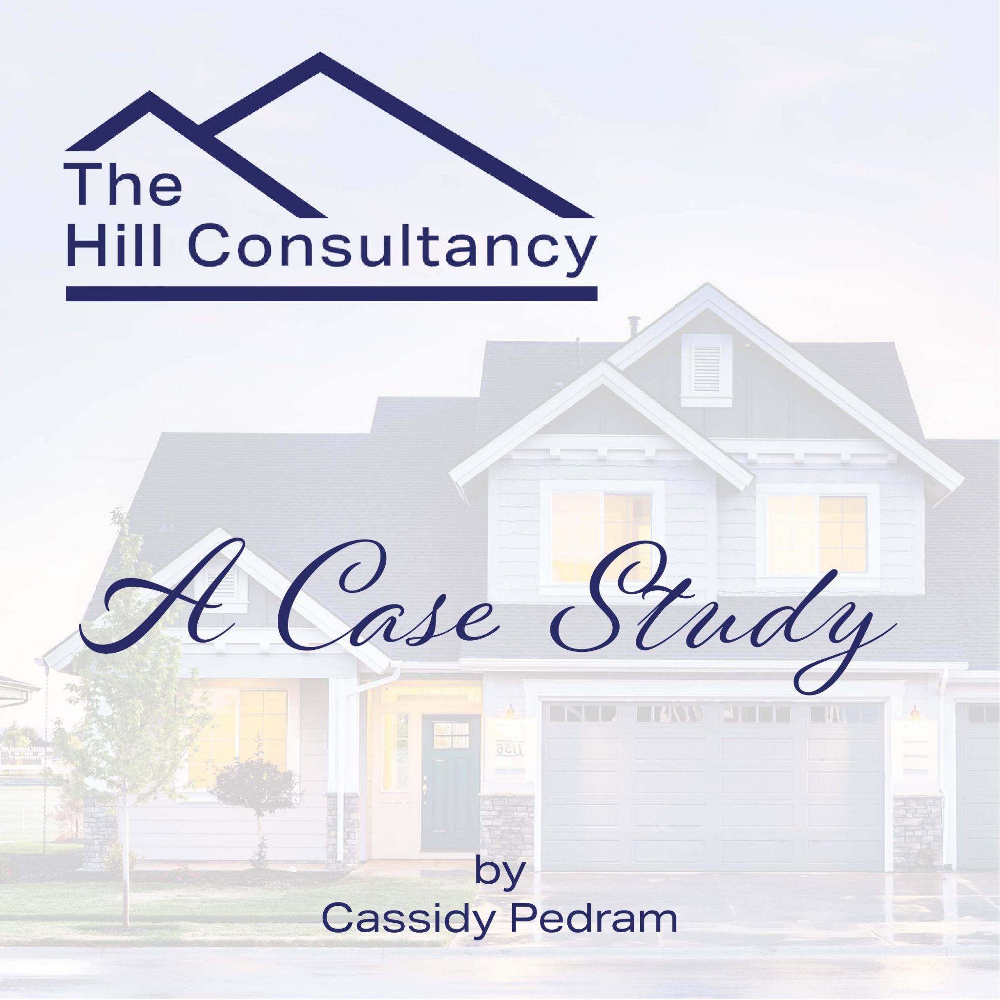
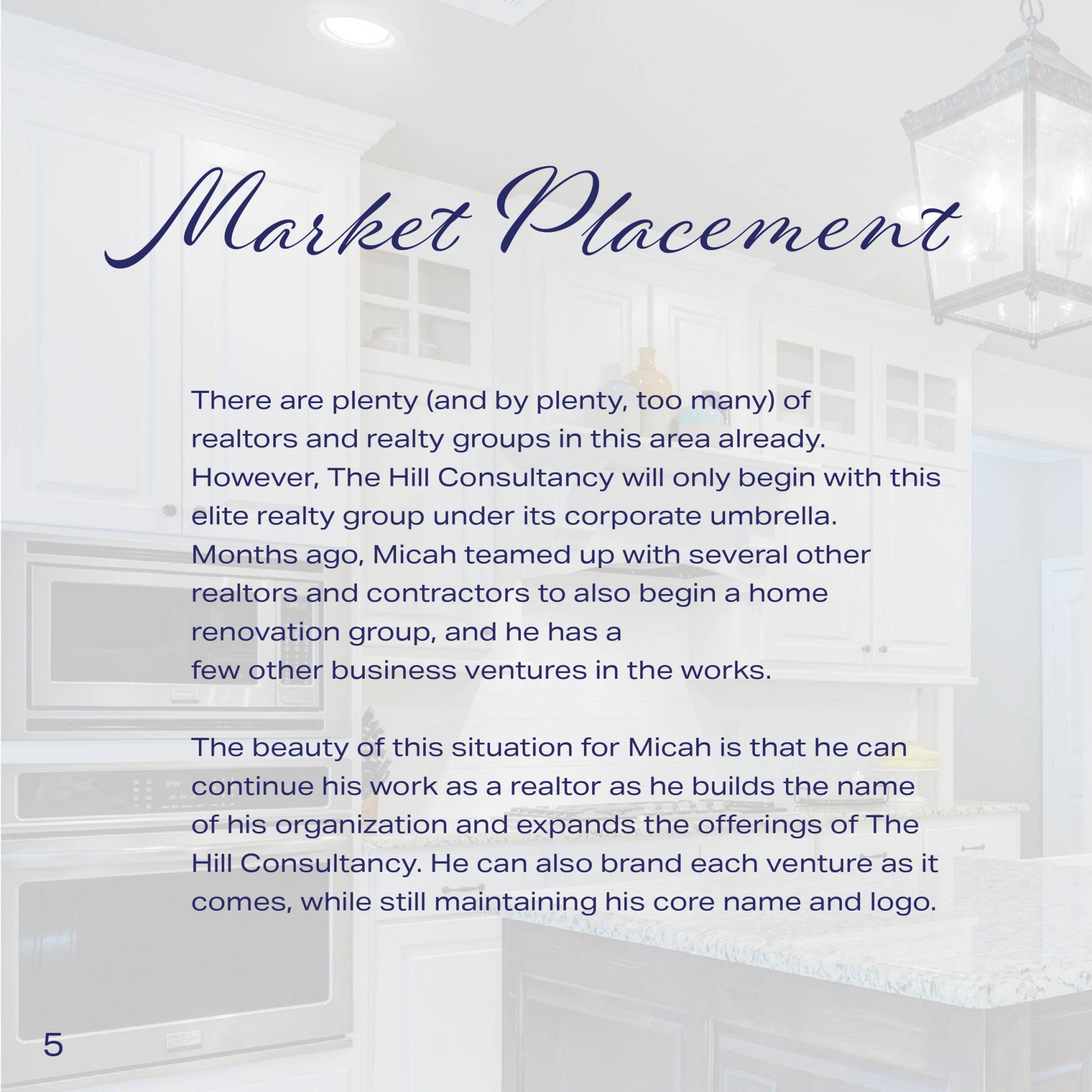
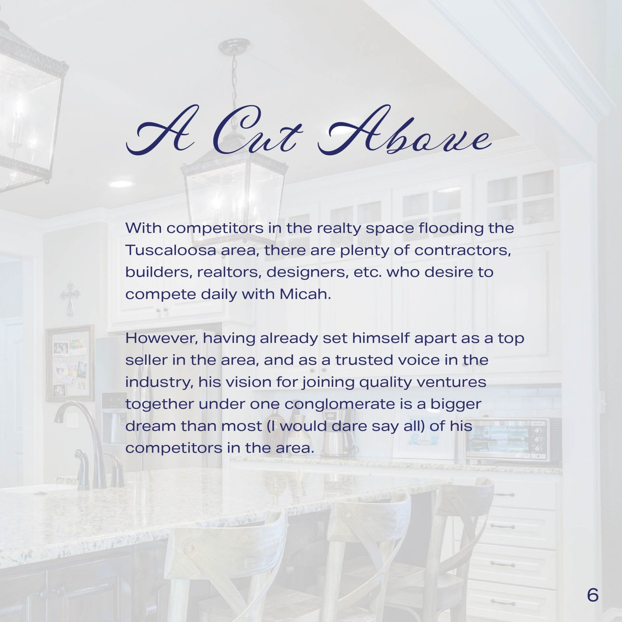
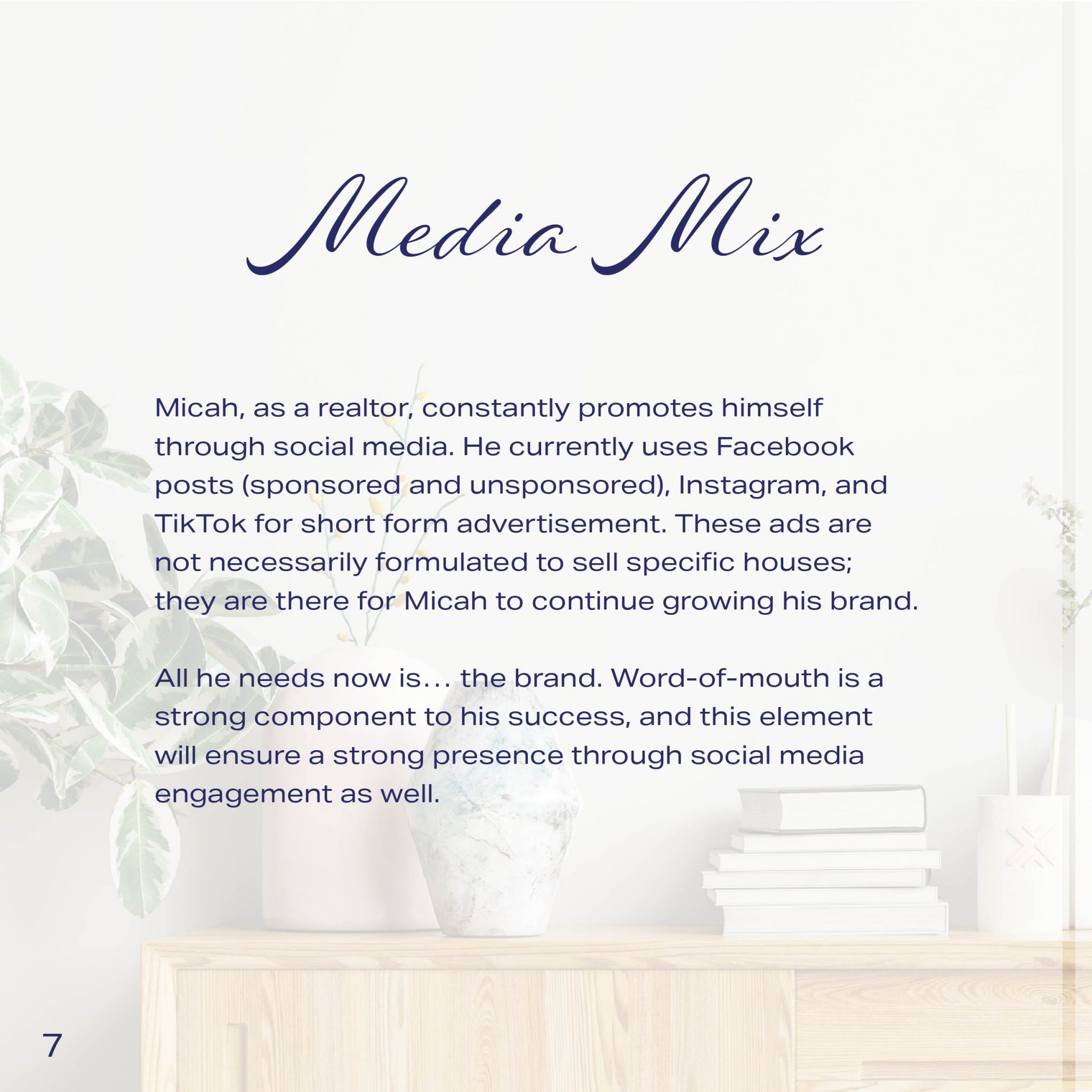
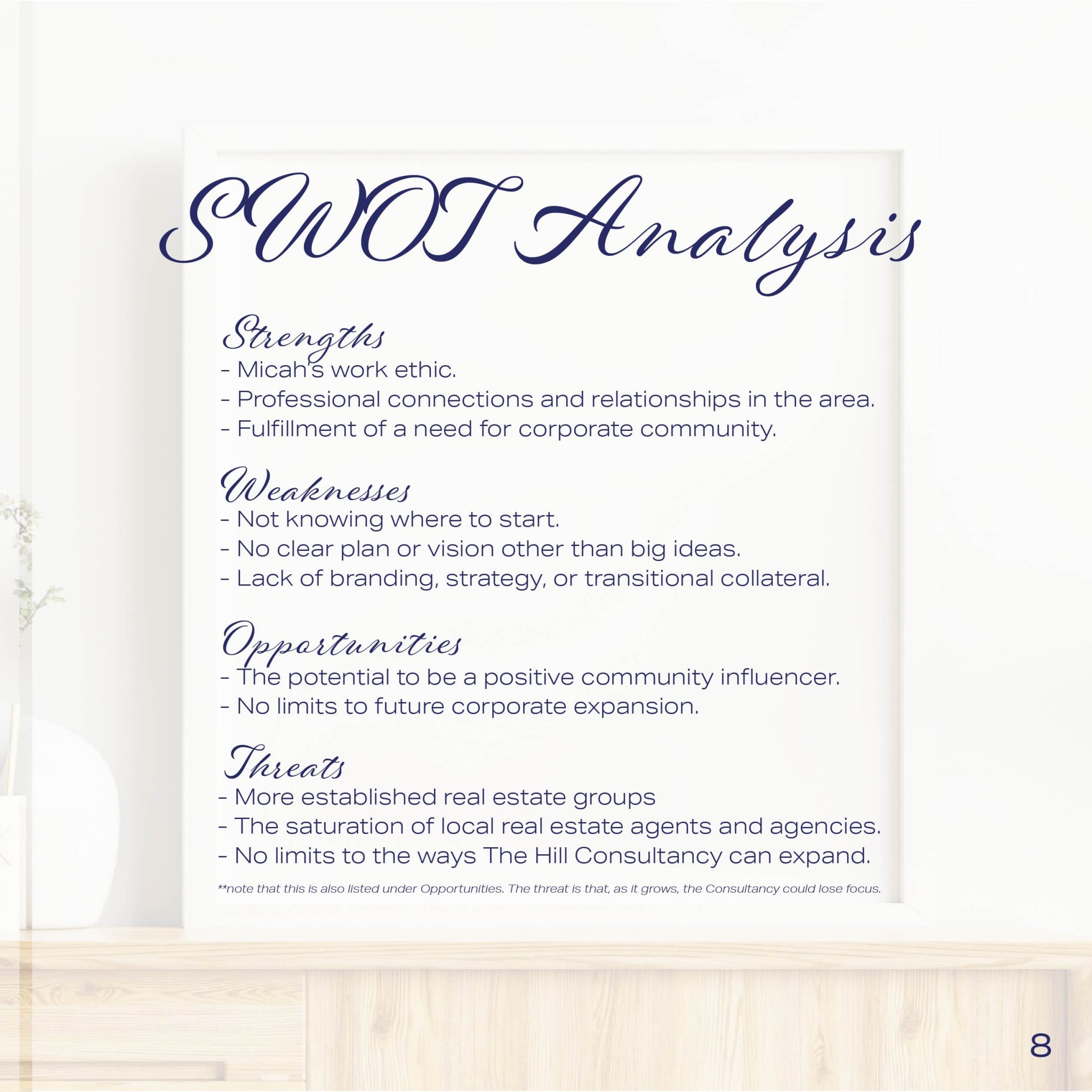
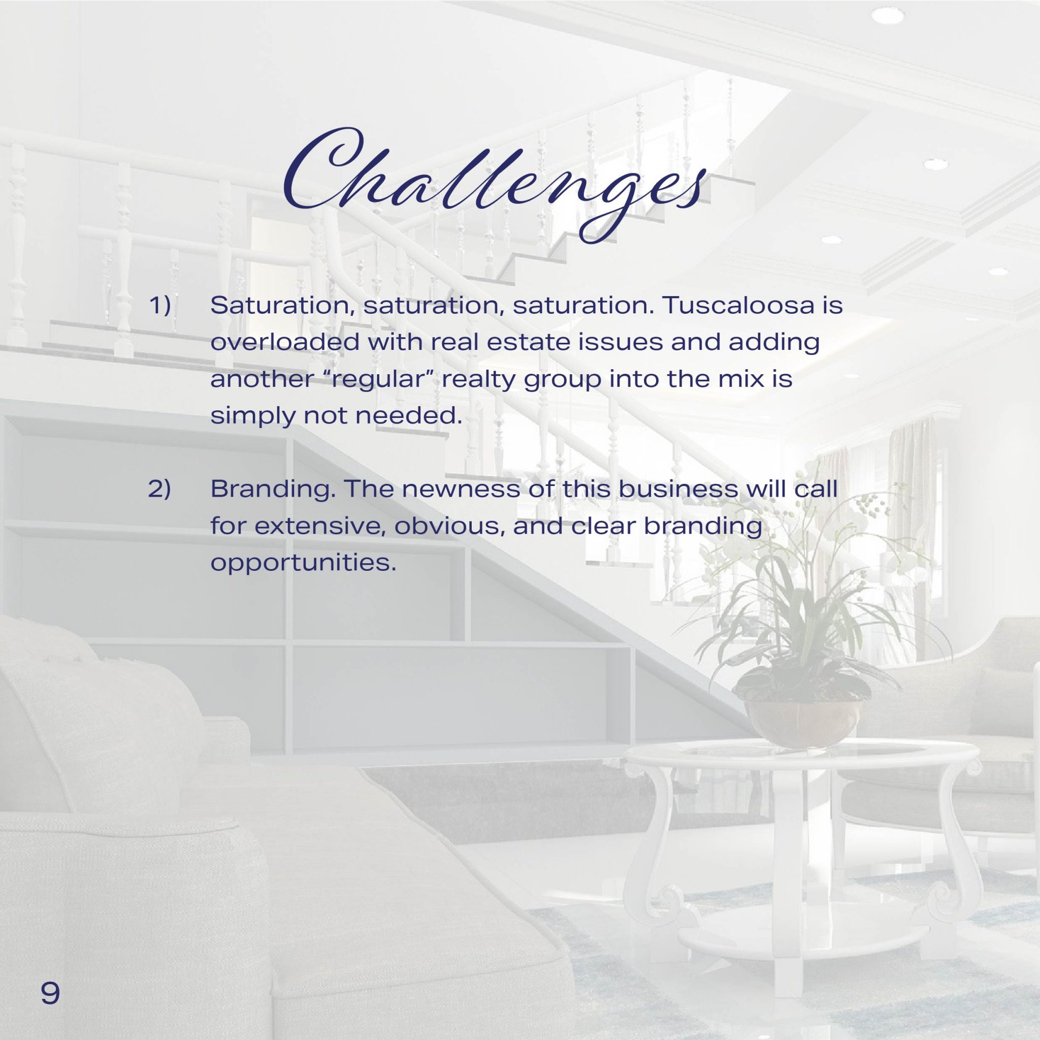
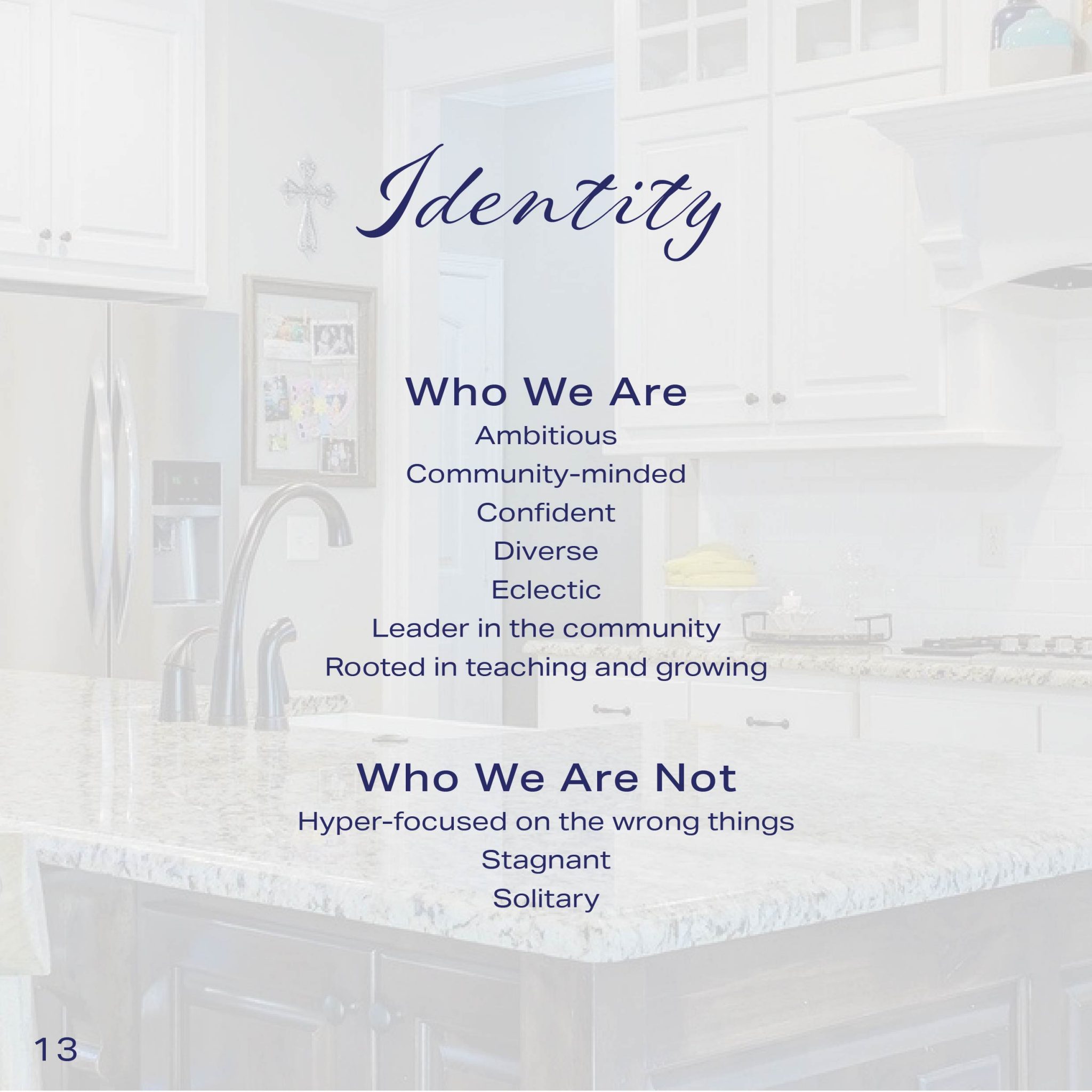
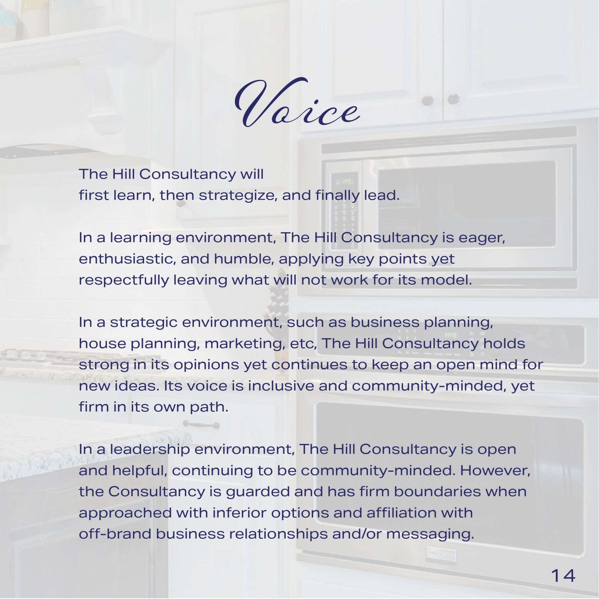
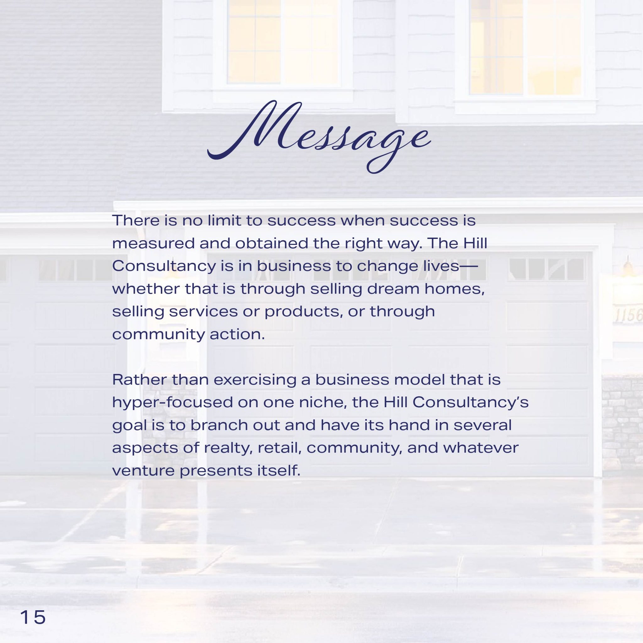
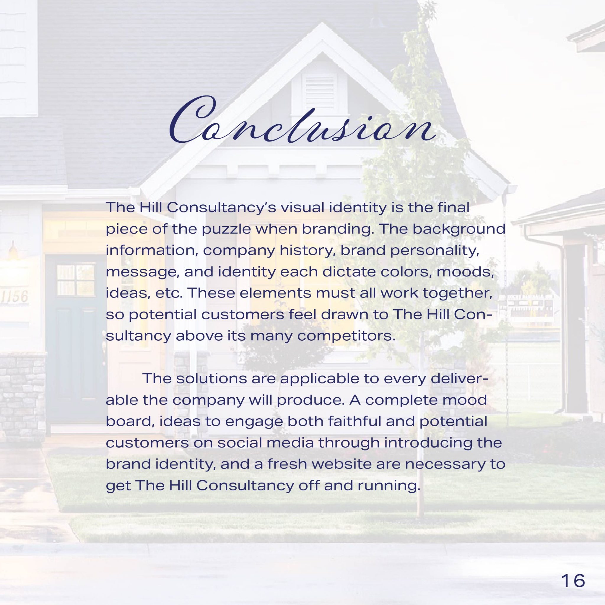
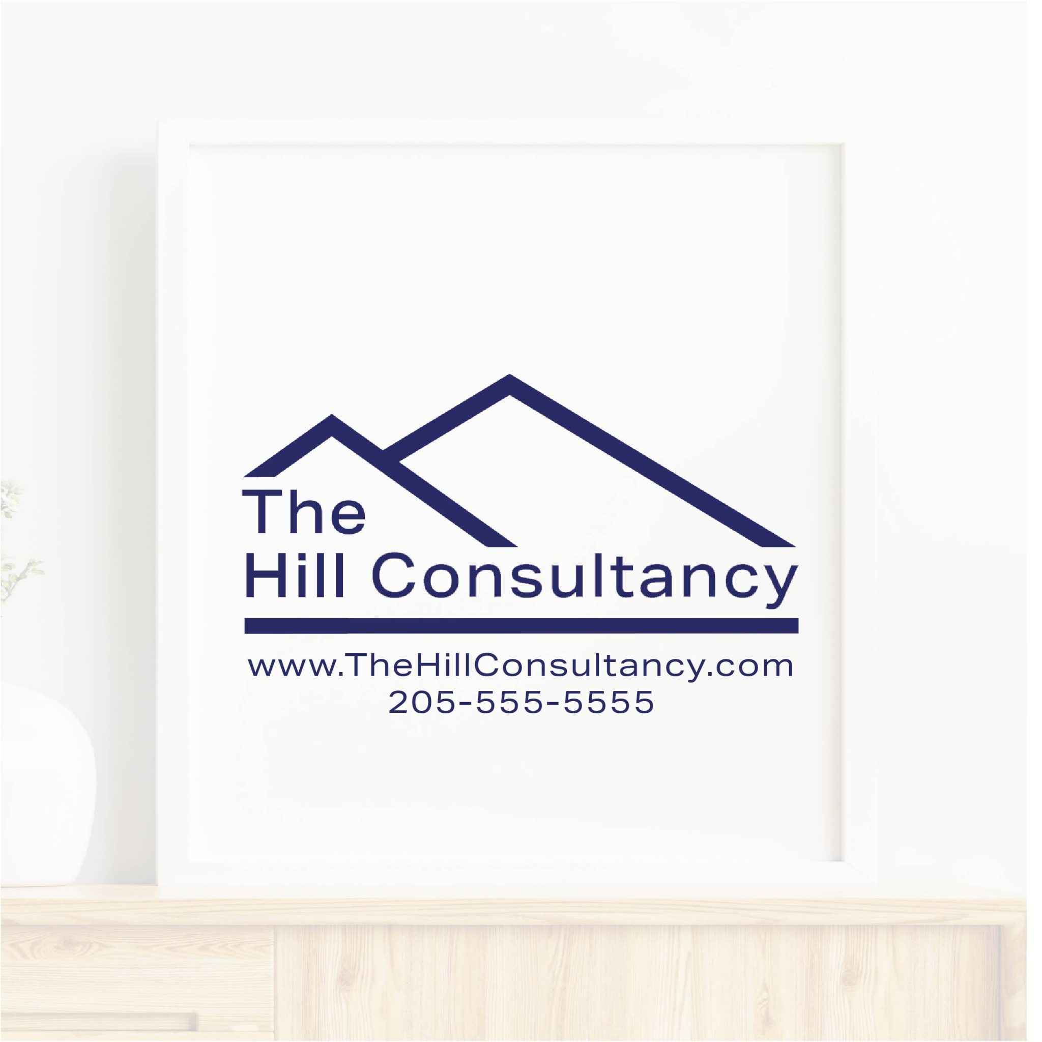
The ask: Case Study for The Hill Consultancy
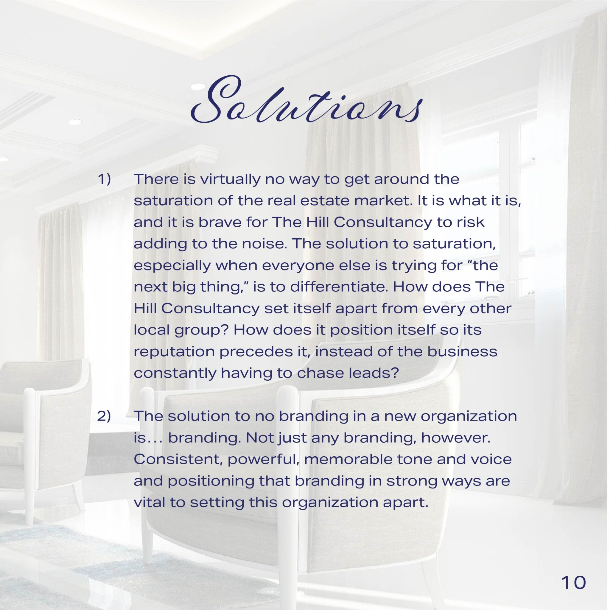
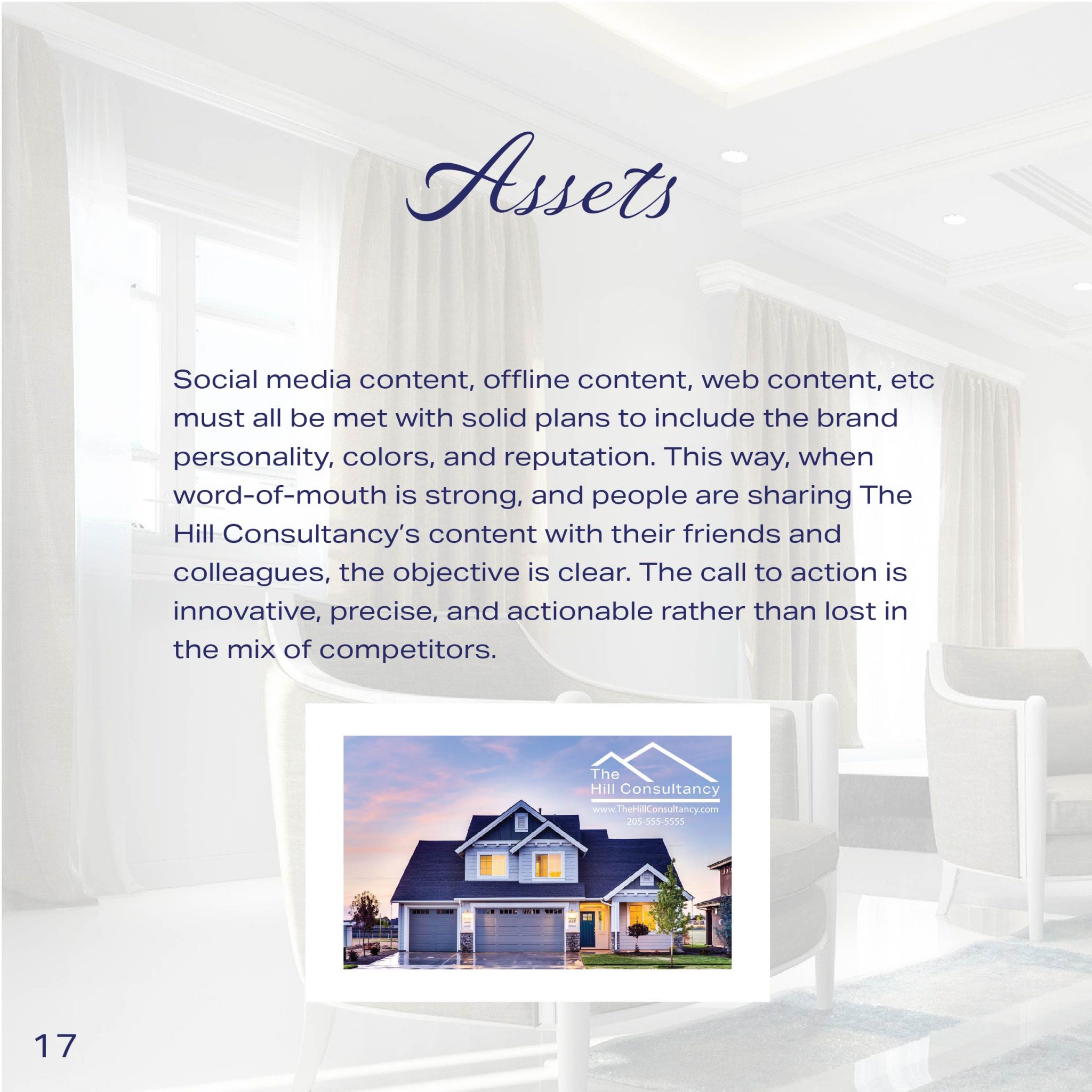
The process: Because the real estate market in the Central Alabama area is saturated, a complete Brand Identity Strategy was necessary for The Hill Consultancy, to ensure differentiation and a clear plan for continuing its growth and prosperity in a market where word-of-mouth is crucial.
The answer: A case study that defines who The Hill Consultancy is, who they want to be, and how they will move forward in their community.
Scroll through below, or click here to see the Case Study in published form!


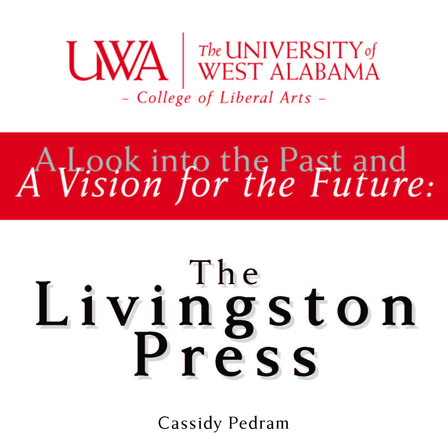
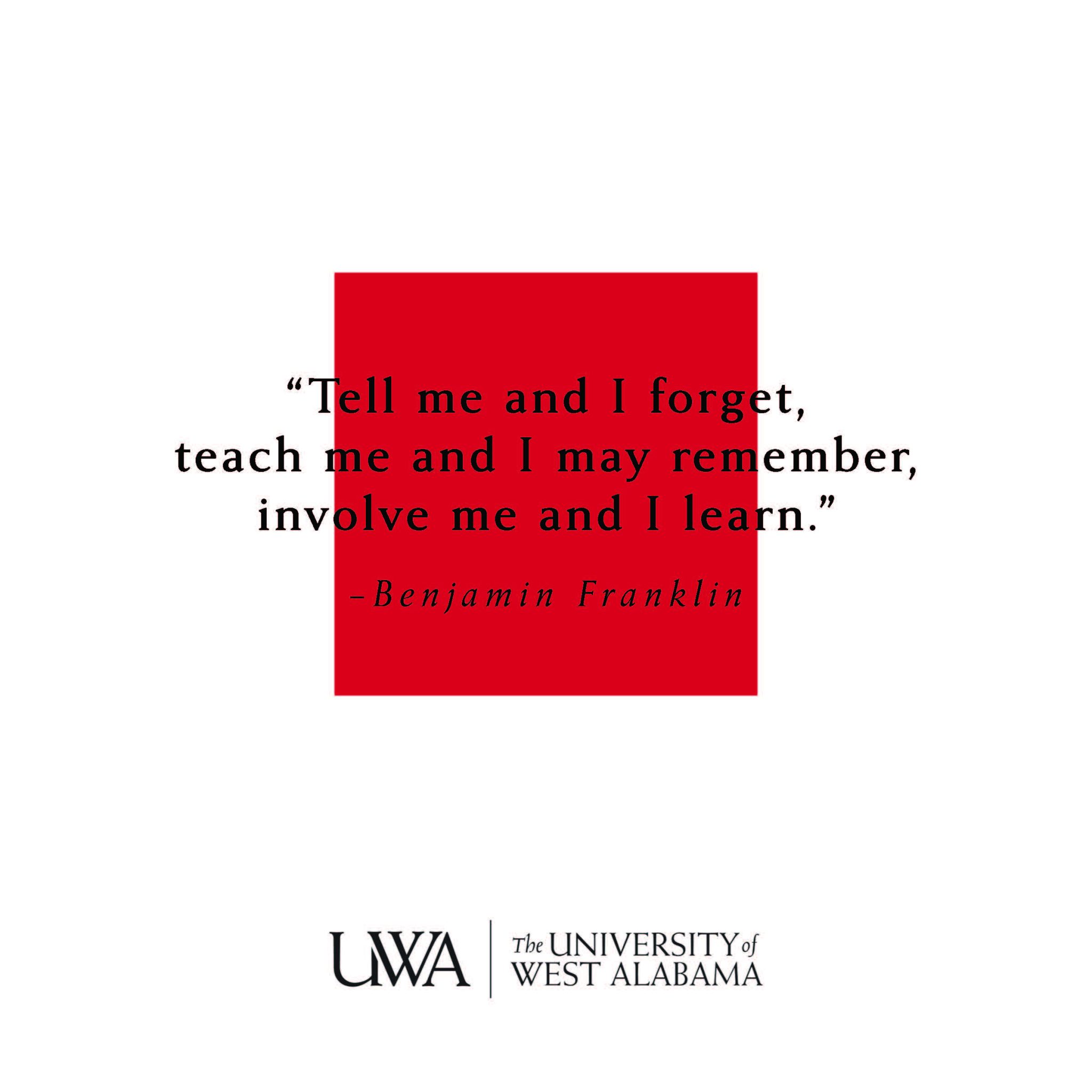
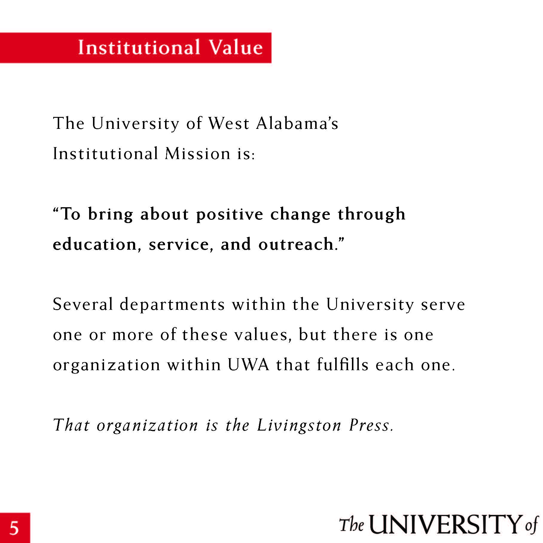
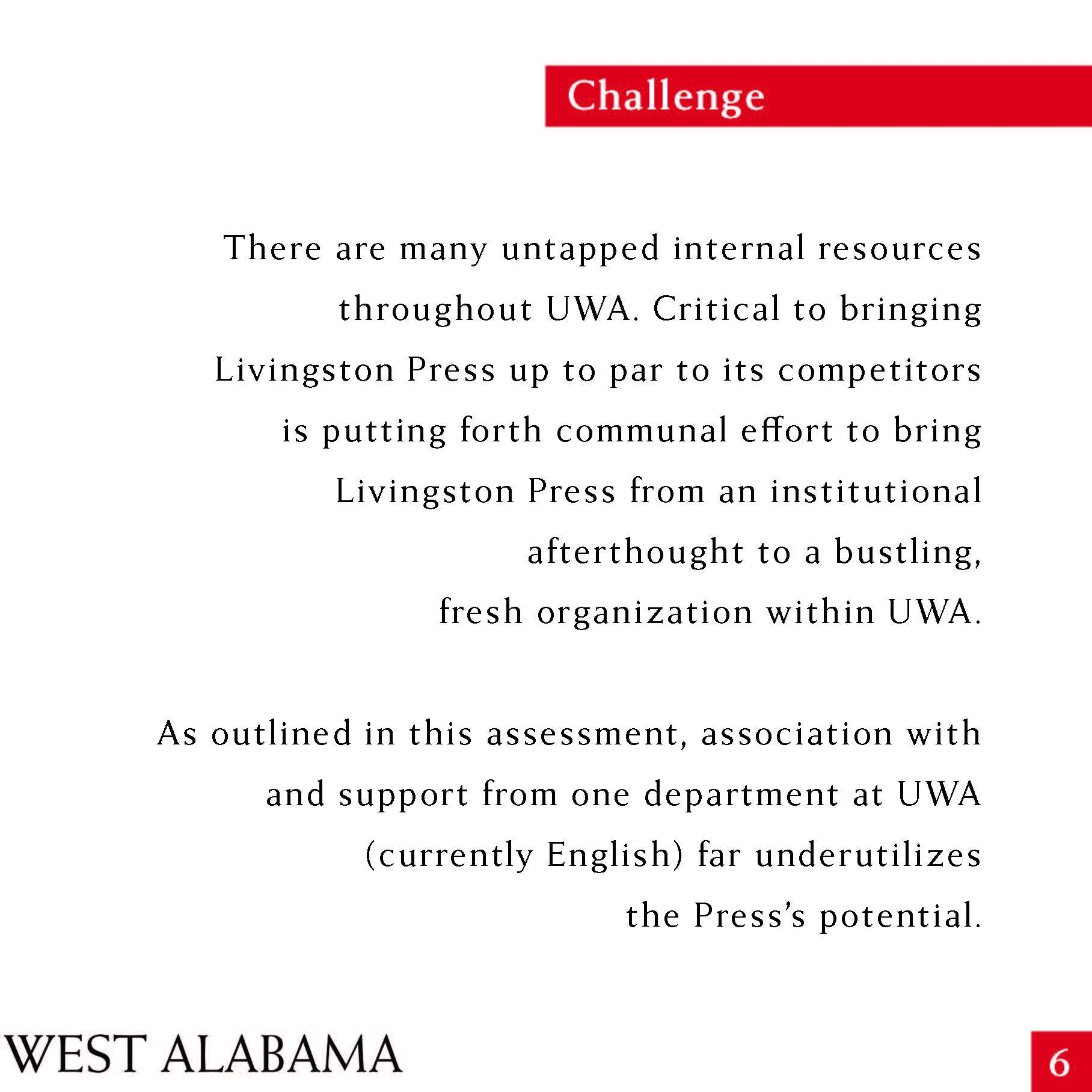
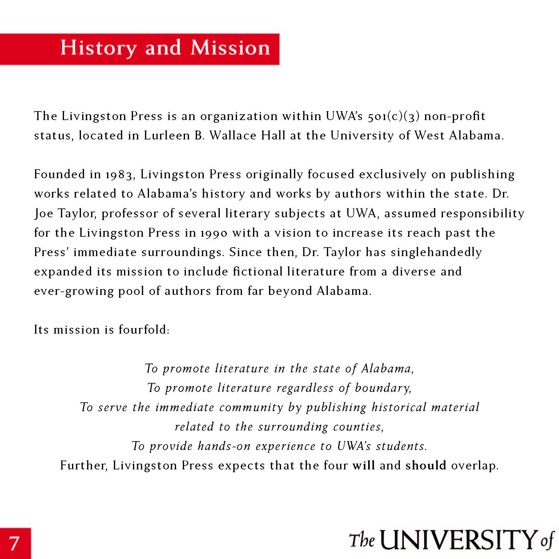
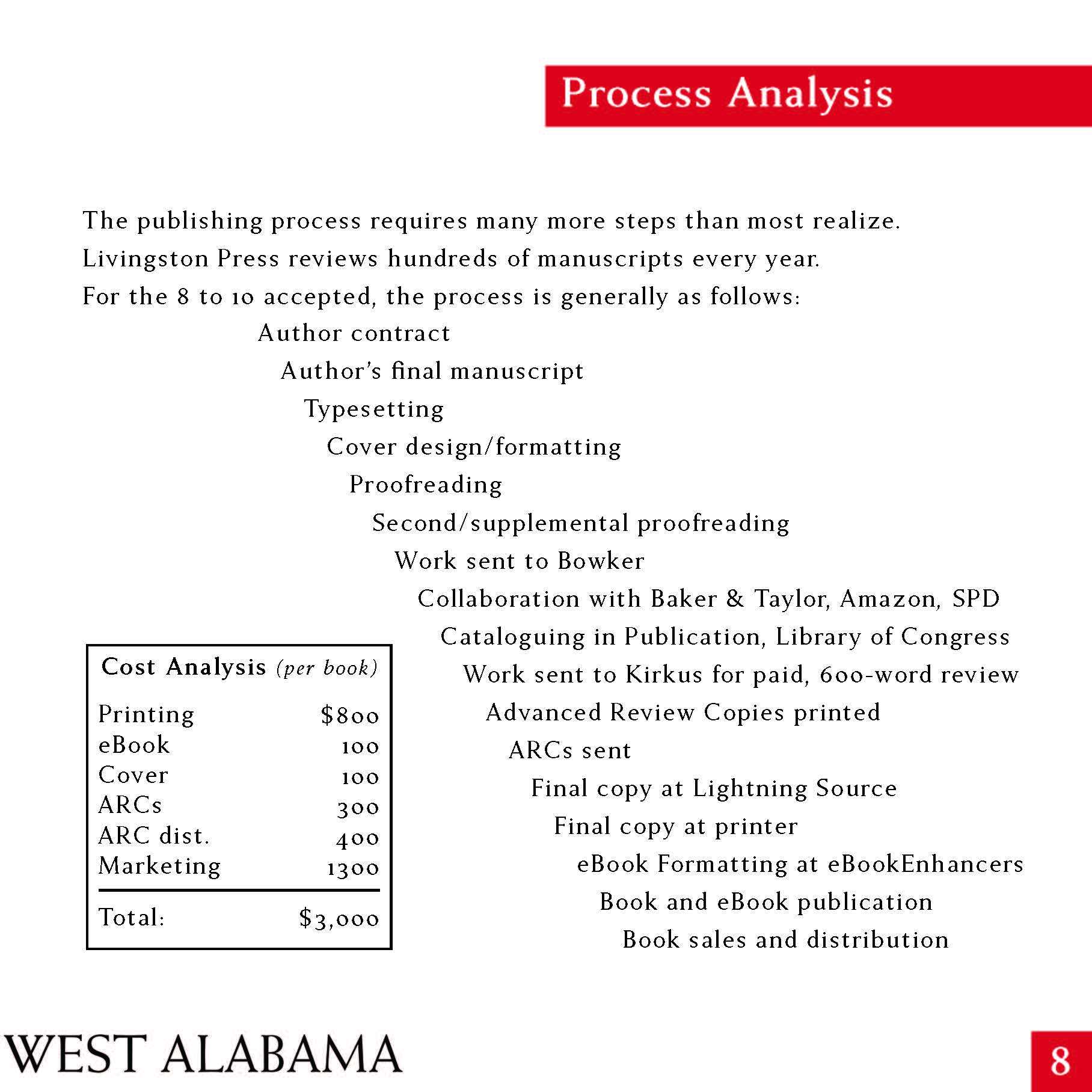
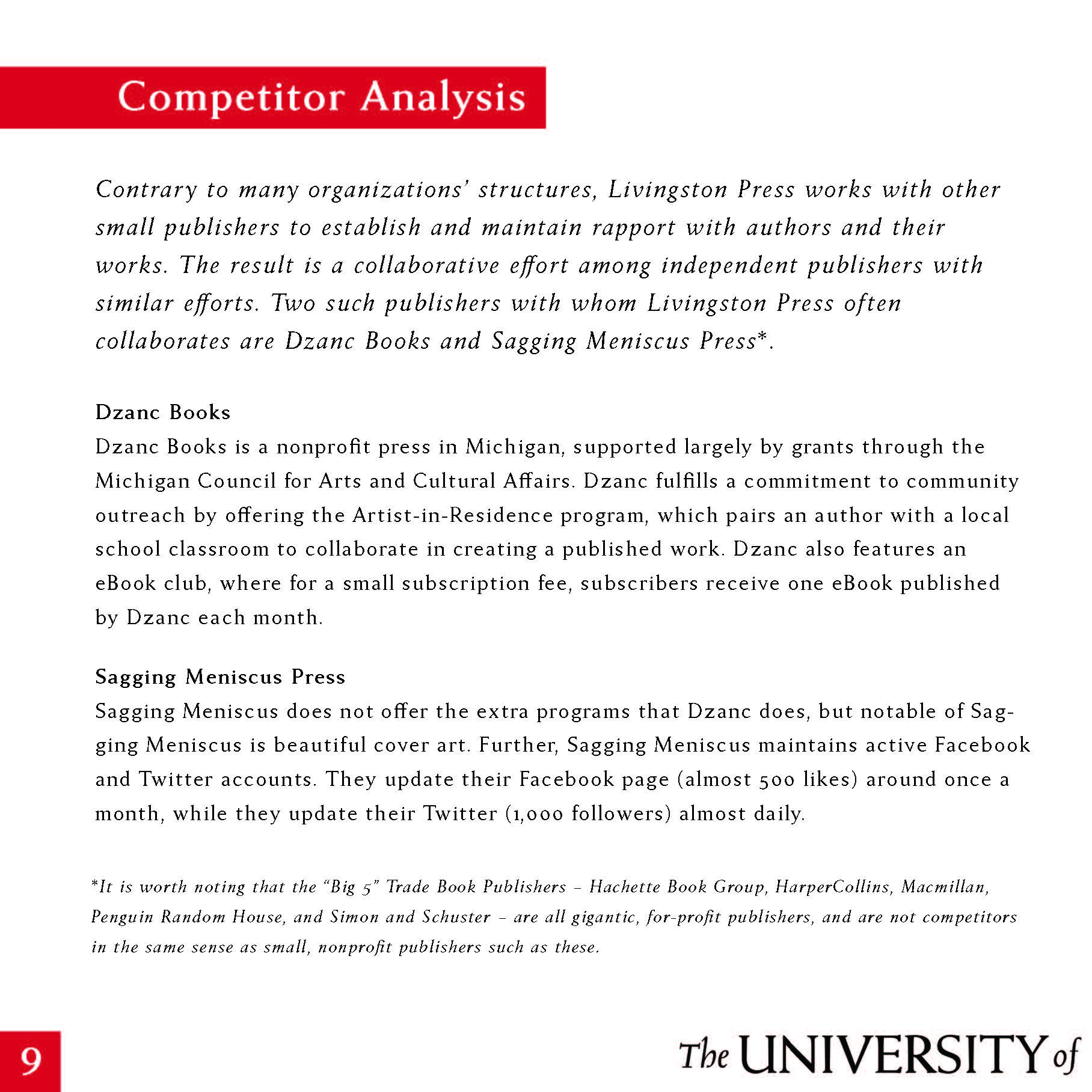
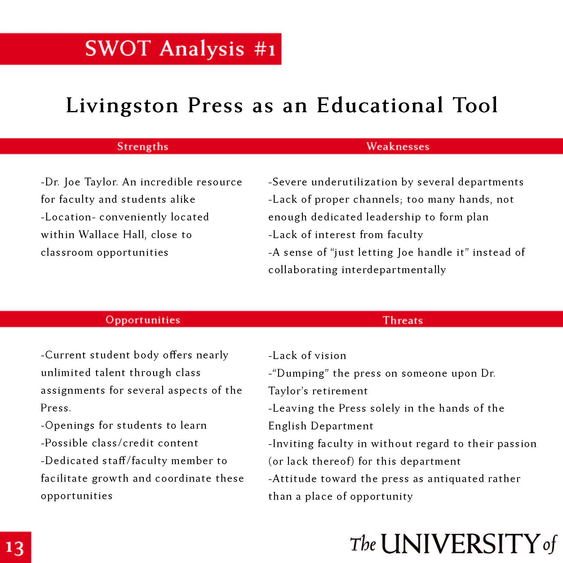
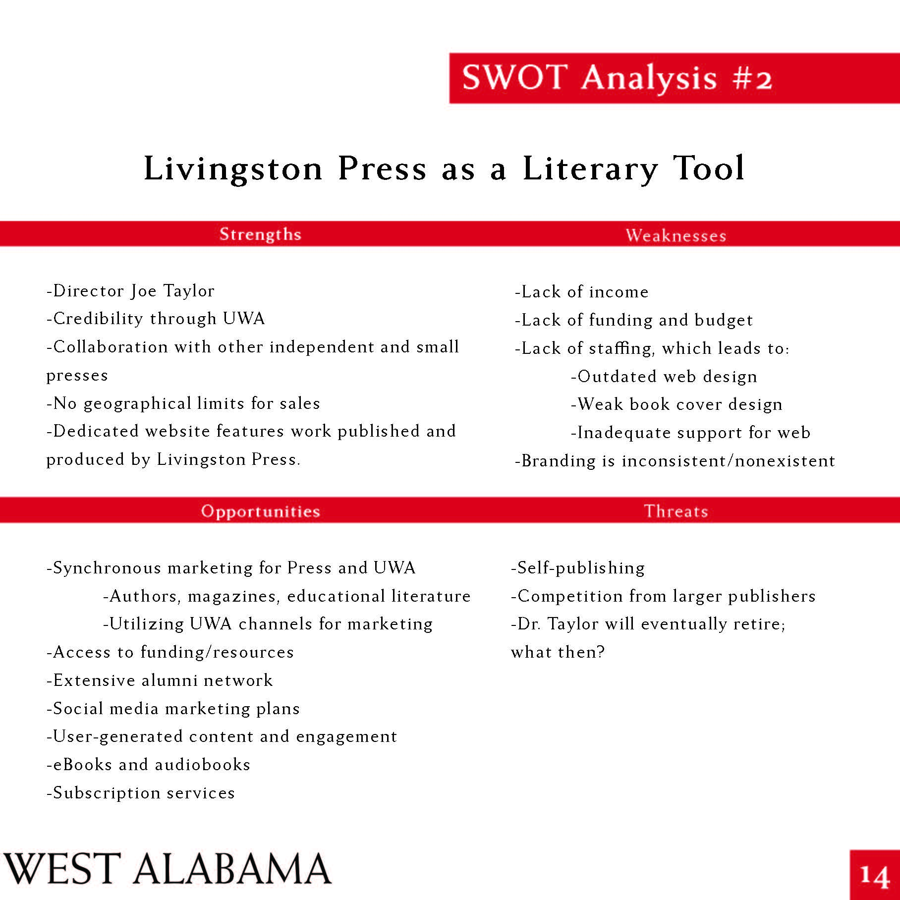
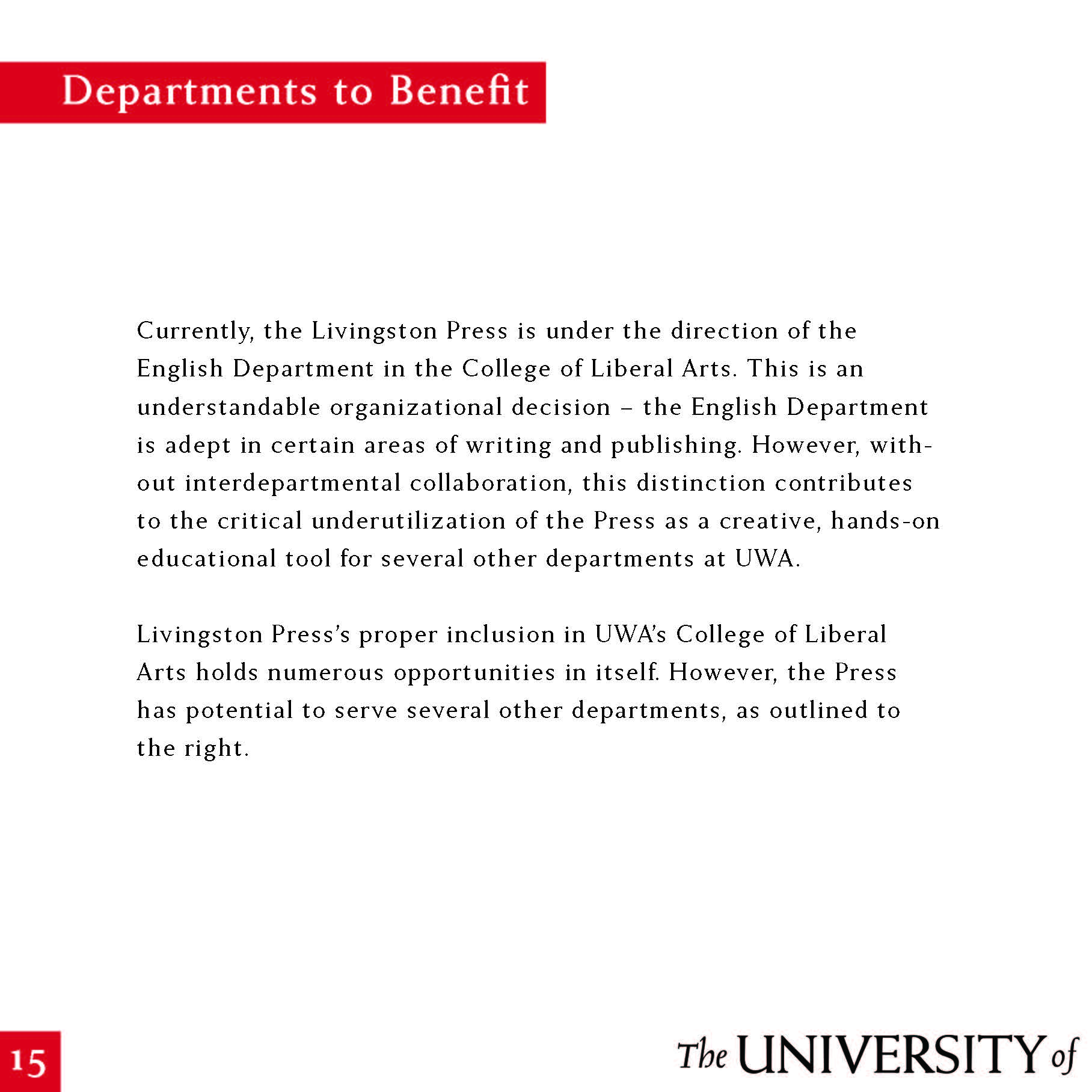
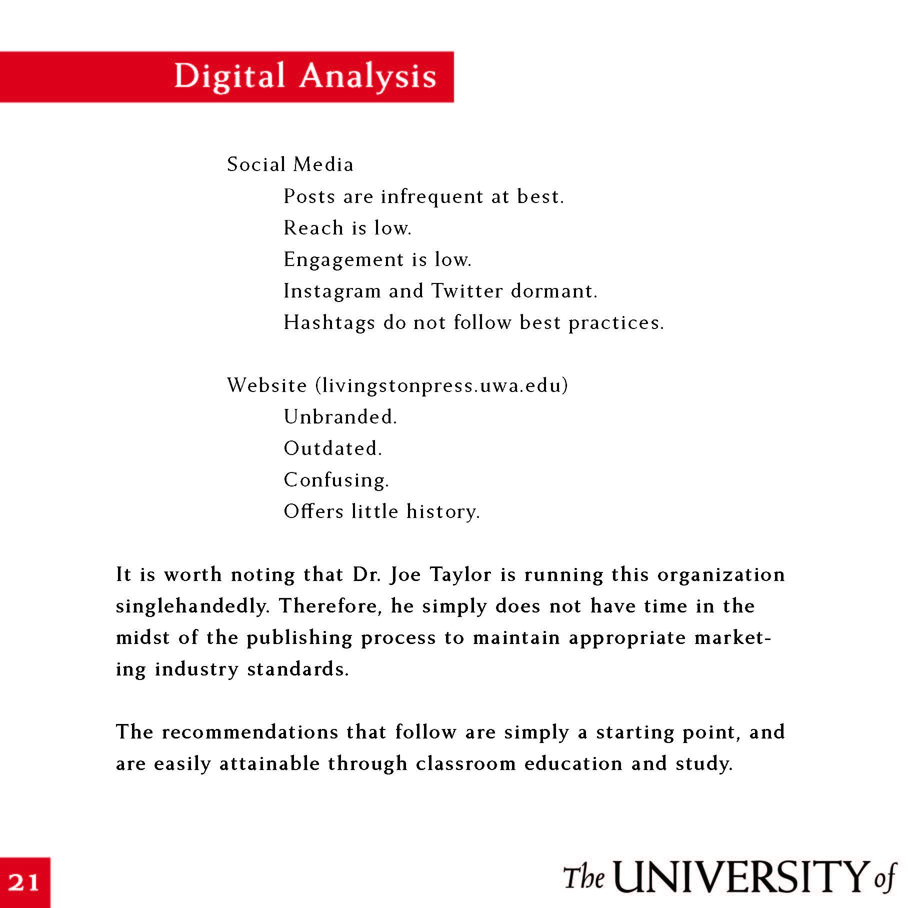
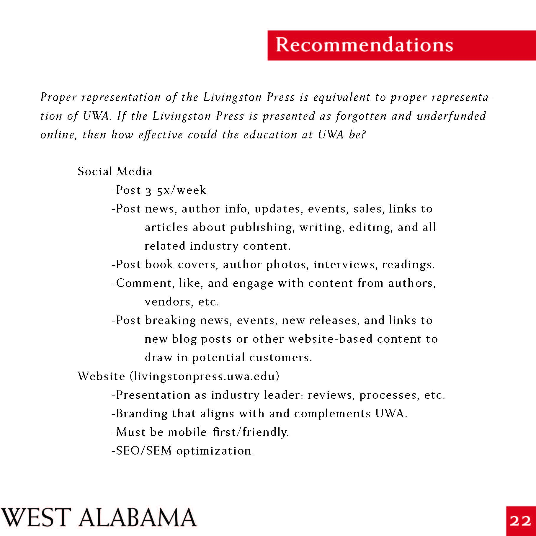
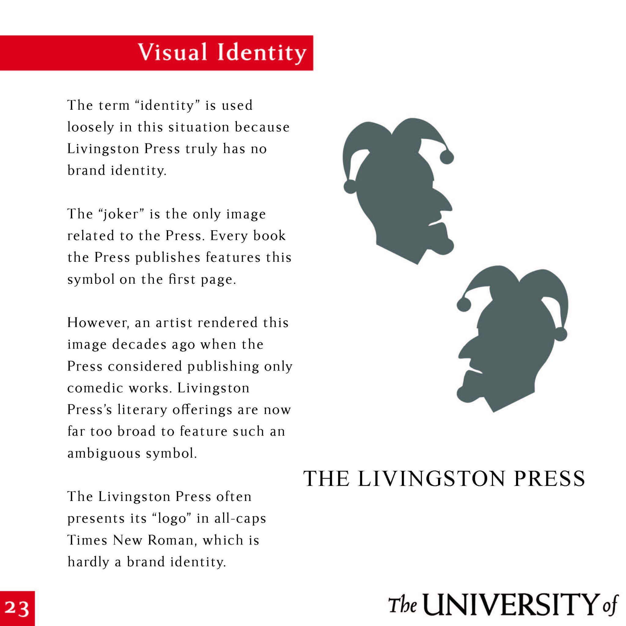
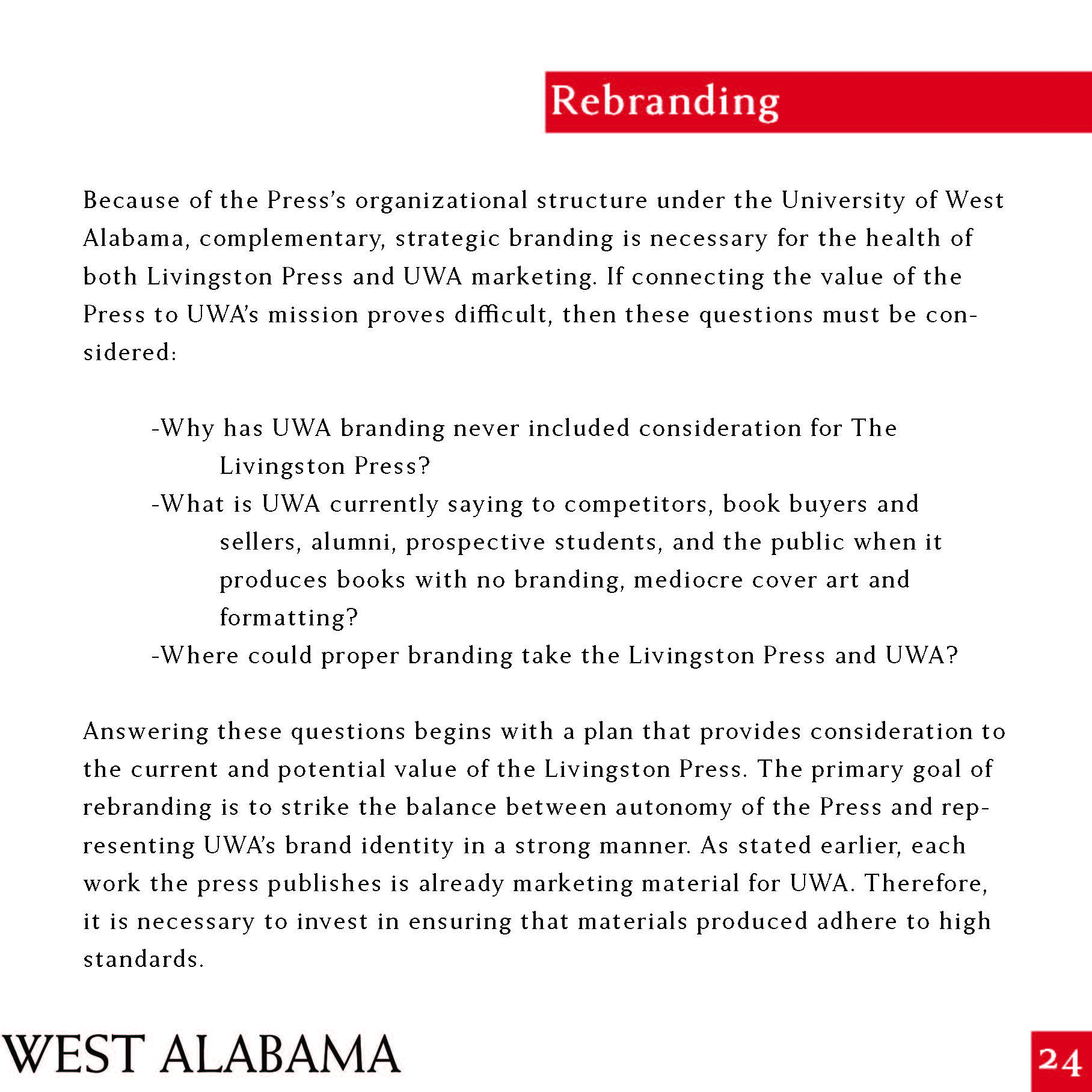
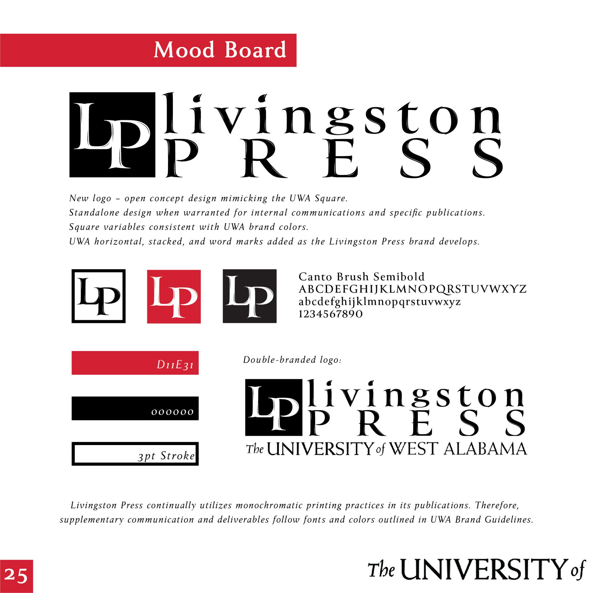
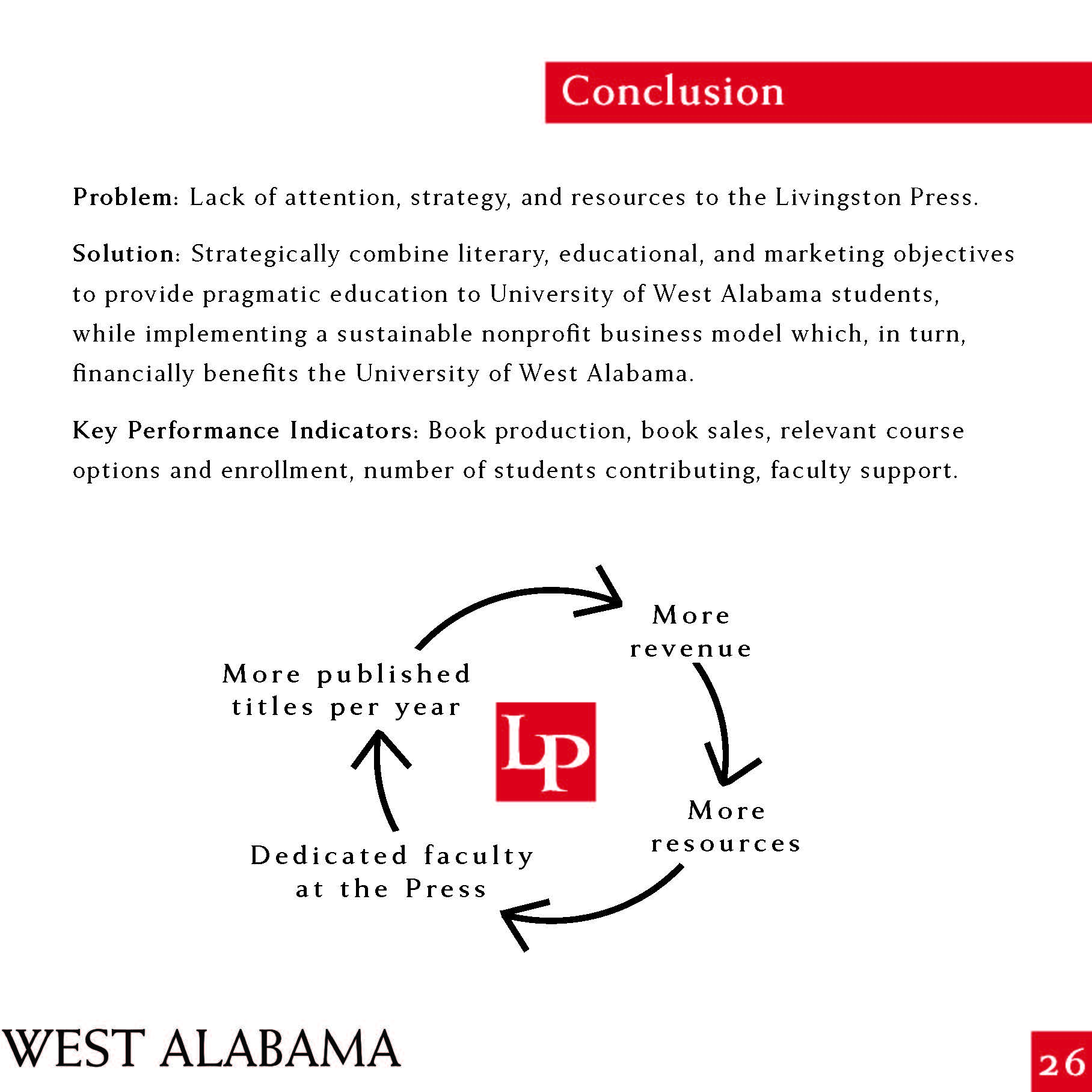
The ask: Assess the Livingston Press and its role at The University of West Alabama.
The process: The value of an organization such as the Livingston Press within the nonprofit umbrella of The University of West Alabama is underrated. Several metrics, including funding, tuition, faculty allotment and involvement, and more, contribute to its overall underutilization.
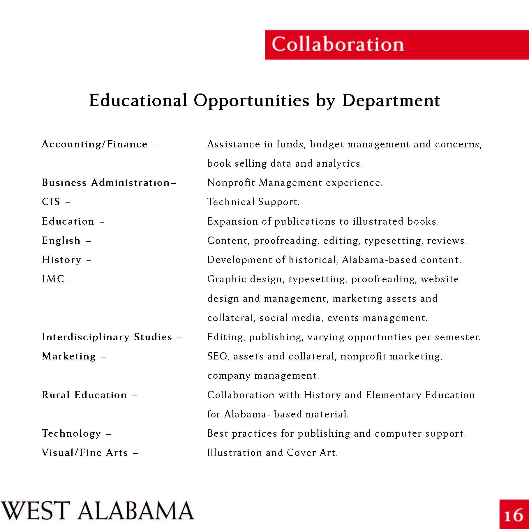
A complete assessment of the Livingston Press as an educational tool, a literary tool, and a marketing tool for The University of West Alabama was necessary.
The answer: A strategy for the Press moving forward, including staff and university involvement and added resources for the Press.
Scroll through below, or click here to see the Value Book in published form!

The ask: Create three movie posters for three different genres of film, all with the same title.
The process: There are plenty of different movie genres, so my goal for this project was to choose three genres that are popular and easily identifiable by their visual content. Once I chose the genres, each poster had its own creative process:
Horror
Here, I wanted the feel to be foggy and mysterious, with an unknown ending to the staircase specifically, so the viewer is immediately drawn into the content. I also wanted the small amount of typography to be generally basic and safe, with the title standing out as skewed and distressed.

Drama
I wanted one of these posters to be more geometric and bold, so the use of the simple yet recognizable colors and the poker chip design invoke the question of where and what the “house” really is. Is it a casino? Is it a basement poker game? See the movie and you’ll find out!

Comedy
When in doubt, go for something unexpected! Because the other two posters showcased grayscale and simplicity, this poster needed to catch the viewer’s eye and be memorable. The point of a movie poster is to catch the eye of a potential moviegoer, and this one does it!

The answer: The result of this ask ended up being a grouping of posters that are clearly understood and appreciated as separate, promotional pieces, but also can be seen as a triptych of sorts, where the aesthetic of each piece complements the other two.
The ask: Create a logo and brand collateral mockup for Shiew Outdoor Services.
The process: This was SUCH a fun project! This company is run by a great guy with a heart to help people. His vision for Shiew Outdoor Services (SOS) is that of a landscaping company that doubles as a discipleship and mentorship program for young people.
With that in mind, my challenge was to create a logo that can be universal enough to present his company both as a landscaping endeavor and as a symbol of a growth opportunity for young people who need experience and guidance.
This project was one that I had a clear vision for from the start. I knew I wanted to create a simple tree shape, and if possible, incorporate the SOS. I also wanted the logo to be easily changed from color to color because hopefully, there will be swag for this company soon and there might only be one color option when it comes to ink/silkscreen choices.
The answer: I was so excited to come up with the tree shape out of the SOS, and for it to loosely resemble a person with his arms raised! This logo is everything the client asked for, and I am so excited to see it everywhere one day!


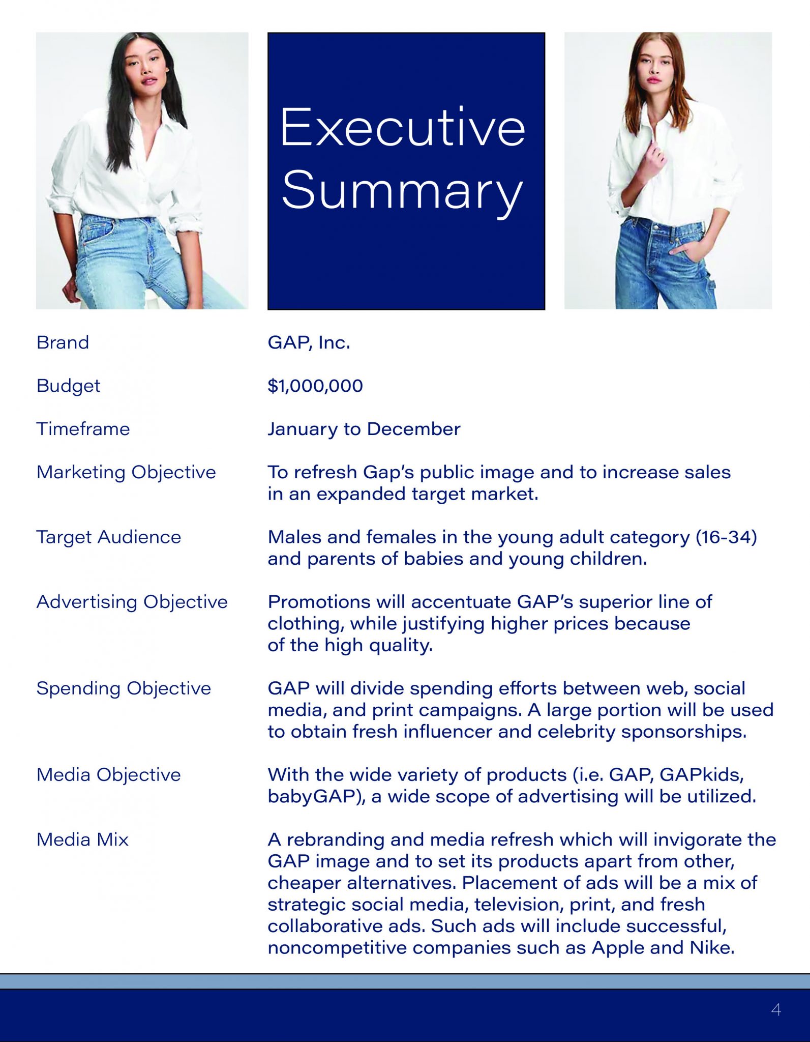
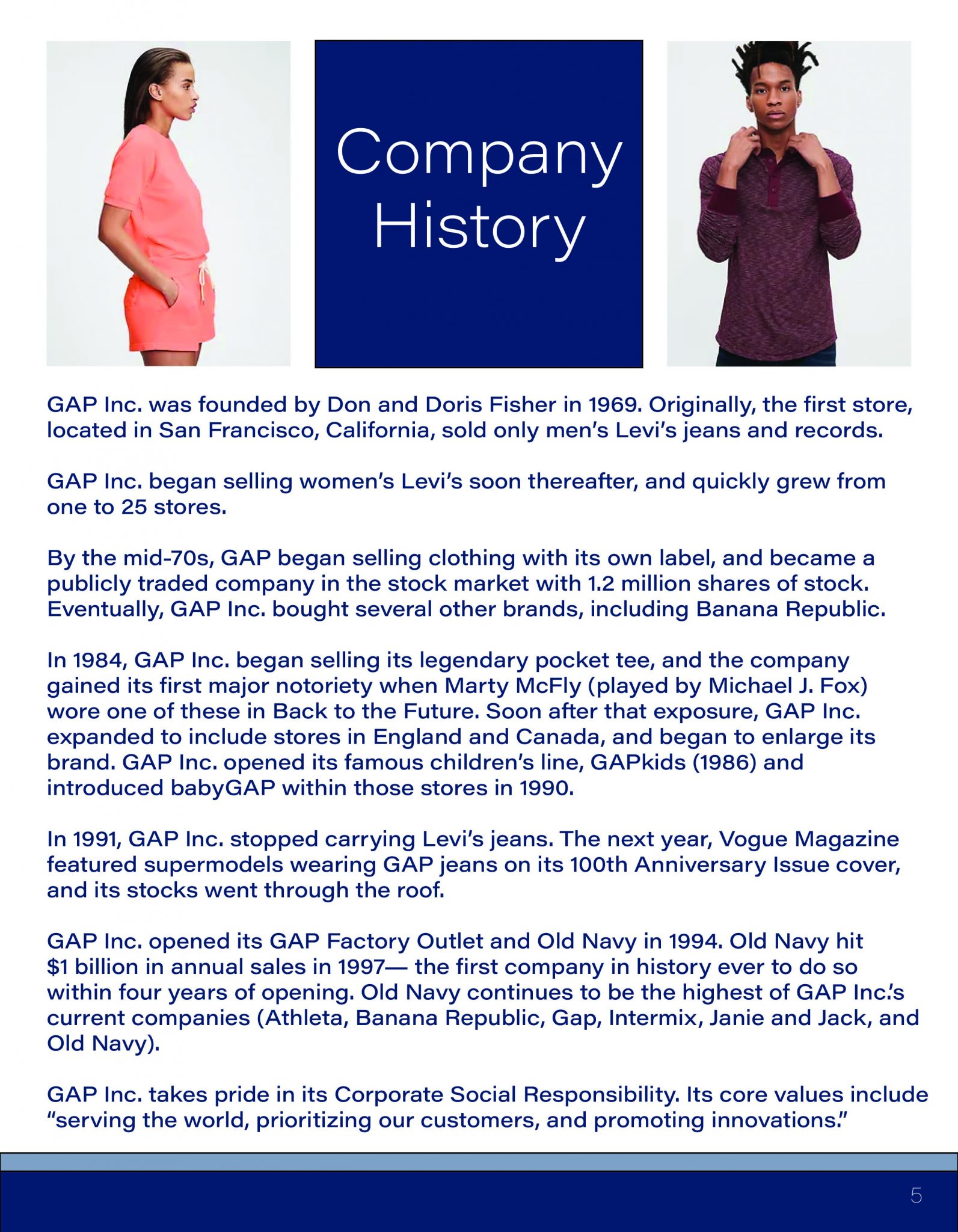
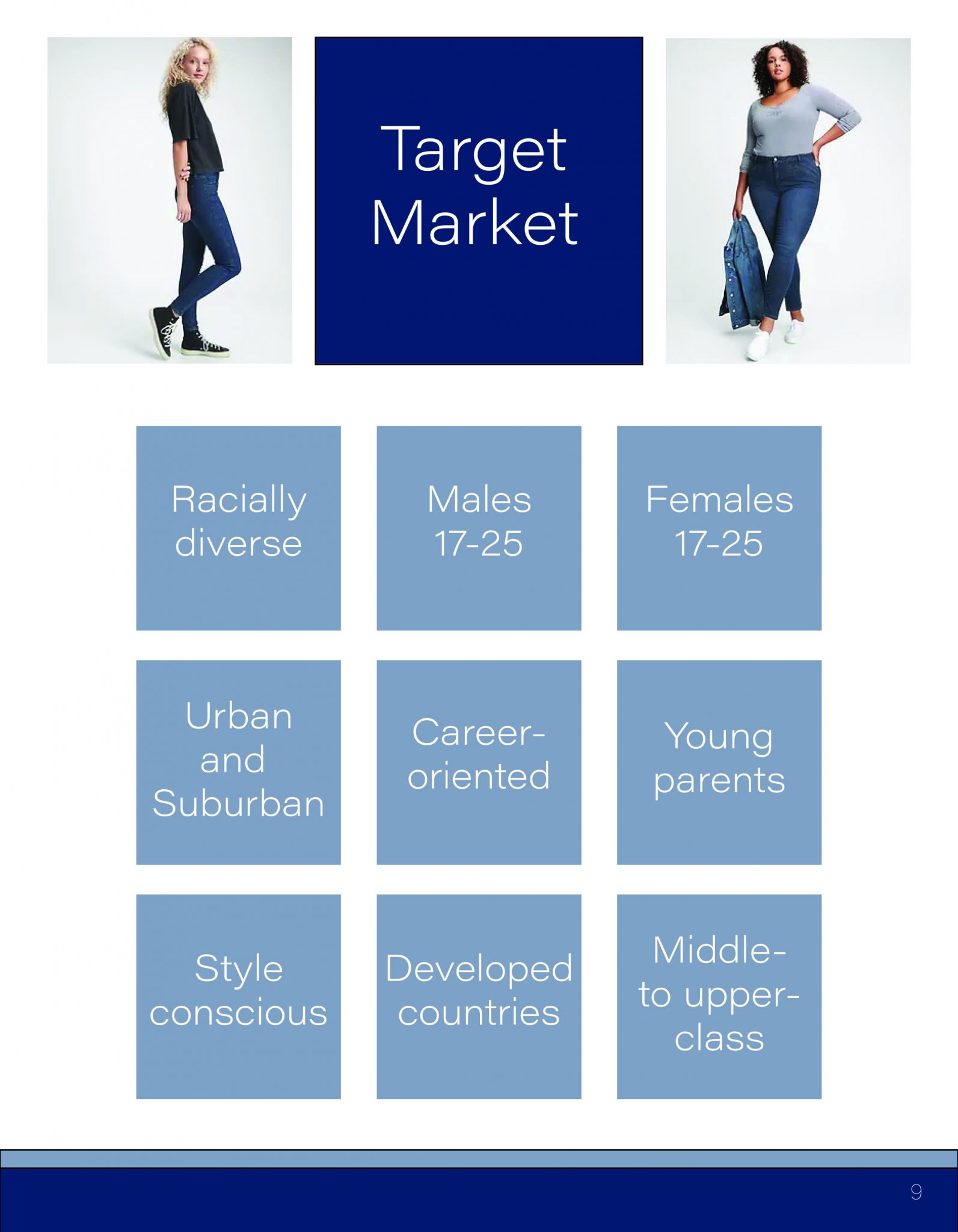
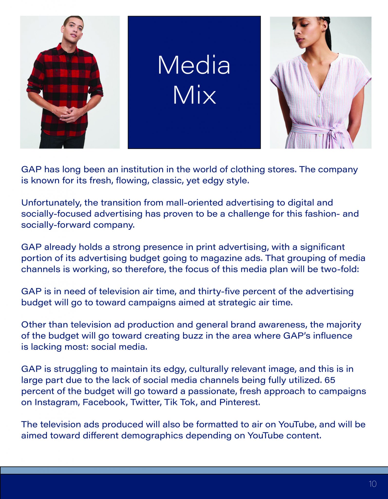
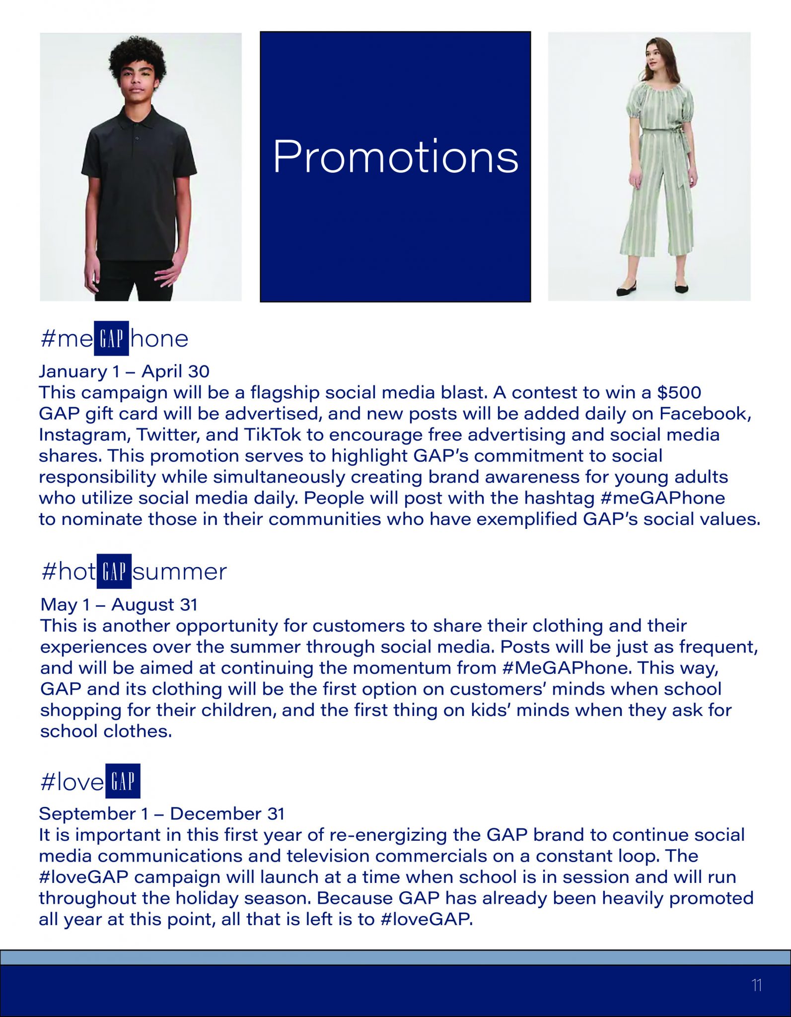
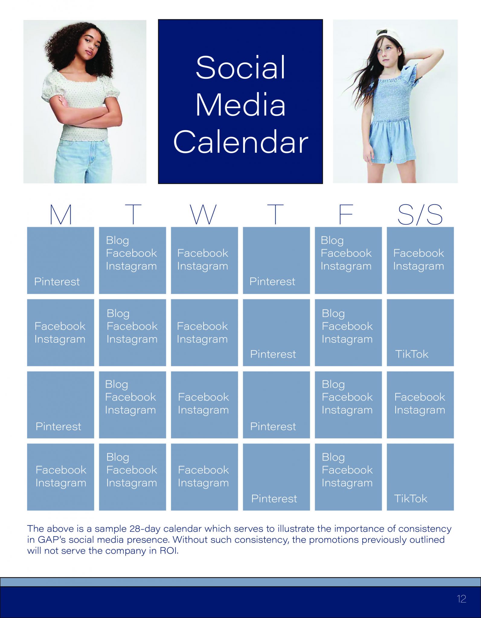
The ask: Create a Media Plan for GAP Inc.
The process: GAP Inc. has a distinct brand. This not only includes the company’s graphics, but also its clothing design, ad structure, and social values. My goal for this project was to do the iconic brand justice, while establishing a plan which accentuates its strengths, rather than distracting from them and creating more issues.
The answer: A Media Plan which contours to GAP Inc.’s high standards.
Scroll through below, or click here to see the Media Plan in published form!
The ask: Create a company using one random word. Develop logo, brand collateral, company history, and a simple marketing strategy.
This was a project in my undergraduate program, but I included it here because I really appreciate the concept of being “thrown in” to situations. It is a bit cheesy; I’ll give you that… but it was also a great challenge!
The process: My random word was “chubby.” Yes, “chubby.” The obvious first challenge here was to attempt to incorporate this word into a business name in a non-offensive way, and the next was to create a company around the word that would somehow be respectful yet easily remembered.
Before I could create the collateral elements of the ask, I had to build the company itself.
This one took a LOT of sketching, playing around with lettering and most of all, an open mind. I started by simply writing the word “chubby” over, and over… and… over… again. Eventually, as they always seem to do, the letters started dancing around, and I began to see a butterfly in the two B’s of the word. Aha! More sketching, more playing with the words, and suddenly, a chubby butterfly was looking right at me.
The challenge was still there, however: how would I incorporate this creatively and respectfully into an actual business?
Because I kept thinking of how silly and irreverent my word was, I decided to try and go in the opposite direction with the company’s background. I developed the most wholesome, all-American company history I could, and what says “wholesome” better than freshly-baked cookies?! …Chubby Butterfly Cookie Company was born!
Now for the logo. The company bakes cookies, so I needed to think of the logistics of packaging. To me, this required a simple symbol that could be easily be stamped or printed on cookie-sized packaging and brand collateral (like coffee cups) if needed.
I wanted the symbol to be elegant yet bold, and whimsical, yet self-explanatory. I didn’t want a logo that required the words “Chubby Butterfly Cookie Company” on every package, because logistically, there just wouldn’t be space for that. That being said, I wanted the logo to include a butterfly, a cookie, and preferably the letters “C” and “B.” Whoa. Let the sketching and doodling begin!
The glory of the artistic process is just that. The process! It all came together, and I think Harold Hughes would be proud (see the company history!)
The answer: Chubby Butterfly Cookie Company


Company History
In the summer of 1993, retired businessman Harold Hughes and his wife, Kathy, prepared for their annual family barbecue. Kathy prepared her favorite picnic recipes, including Harold’s very favorite— her signature chocolate chip cookies, which Harold, her children and grandchildren had come to expect at every gathering. They were always the first food brought out, and the first gone. No one baked cookies like Grandma Kathy.
As Kathy presented her cookies at that party, a butterfly landed on the cookies’ Tupperware lid, and Harold joked that the butterfly would get chubby if it ate too many.
The next year’s barbecue came with heavy feelings: Harold had passed away suddenly the previous November, and Kathy was filled with bittersweet memories as she prepared her signature dishes for her family. Among these, as always, were her late husband’s favorite— her chocolate chip cookies. Kathy struggled to prepare them, but she knew how much her family loved them, and she wanted to honor Harold’s memory.
As Kathy brought them out at the picnic, a butterfly landed on the Tupperware lid, just as it had the year before! The family laughed through their tears, that it was the same potentially chubby butterfly with which Grandpa Harold had been so tickled.
At the picnic, the family began to talk about Grandma Kathy’s cookies, and how so many more people could be enjoying those and the other foods she so lovingly prepared. Thus, the idea of Chubby Butterfly Cookie Company was born. Kathy shared the secret ingredients in the cookies with her son and three daughters, and her grandchildren learned how to gather and measure ingredients for her recipes.
Together, as a family, they worked together and learned how to run a business. Grandpa Harold would have been so proud. By the time Kathy passed away three years later, Chubby Butterfly Cookie Company was a thriving chain of four stores in southern Michigan, with their main office and bakery in Kalamazoo.
Company Strategy
Just as Harold Hughes grew his own business so many years ago with a strong work ethic, a heart to serve, and a mission to provide for his family and add value to his community, his grandchildren now run the ever-growing Chubby Butterfly Cookie Company with a similar attitude.
With 36 storefronts and bakeries throughout Michigan, Indiana and Ohio as of 2020, the Hughes family takes pride in delivering a uniform product to its customers regardless of which Chubby Butterfly Cookie Company locale they patronize.
Chubby Butterfly utilizes identical kitchen equipment and interior design elements across its 36 locations and strives to hire vetted, professional bakers in its kitchens. The company’s buyers select only the finest, freshest ingredients from locally sourced farms.
The company is also highly involved in the community- it runs a mentoring and employment education program for homeless families, to provide work experience and income for those who need a hand up. Chubby Butterfly also hosts several community outreach events every year.
Just as Grandma Kathy took joy in presenting her goodies to her family, so the Hughes family carries on that tradition throughout its communities.
Marketing strategies for Chubby Butterfly include integrating social media, radio and newspaper campaigns; yet word-of-mouth advertising is at the forefront of this ever-growing chain of bakeries.
The mission of Chubby Butterfly Cookie Company is rather straightforward: add value, add fun, and add more chocolate chips!
The ask: Develop logo and brand collateral for Blue 42 Media.
The process: As a prominent media company, collateral for this business is extensive. Whether the media being produced is digital- on websites and social media, or print- on disc cases, notebooks, letterhead, etc, the logo for Blue 42 required something that would be easily reproducible in black and white, grayscale, and full color.
Therefore, the challenge in this project was to create a visually-pleasing, easily-recognizable grouping of shapes for when color was not an option.
After many sketches with combinations of circles, triangles, squares, and everything in between, I landed on the logo including four blue shapes (4) with two in each color blue (2) and placed in the shape of an abstract B.
This way, the logo is easily recognizable, incorporating “B,” “4” and “2,” whether color and typography are involved or not.
Speaking of typography, I went back and forth on this, between safe and neutral fonts that would have been a nonissue to some that were a bit more decorated, which I knew would be critiqued by some. I didn’t want to use anything too masculine or feminine, and certainly didn’t want to involve any script. In the end, I went with the decorated font because the four shapes in the logo are so simple. I felt as though the client would appreciate a bit of flair, and this particular font works nicely in contrast to the geometry of the shapes. Of course there will be critics, but even if they’re criticizing, they’re still noticing the company!
The answer:


The ask: Design a logo for JLZ, a cutting-edge record company, and include a mockup of a promotional item.
The process: This was a great opportunity to do one of my favorite things, which is to artistically manipulate letters. I wanted the J, L and Z to be interconnected, and added the abstracted record symbol as a simple base.
The answer:


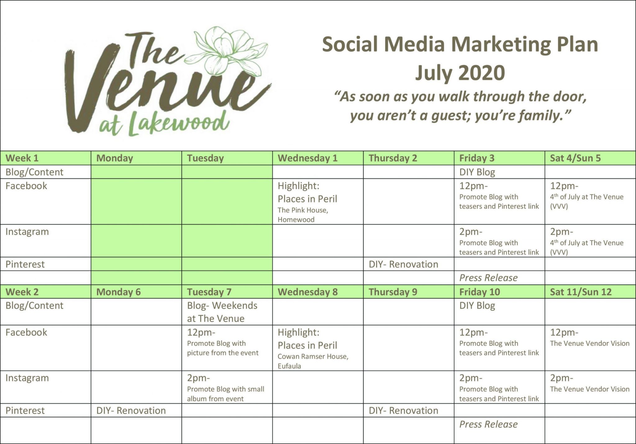
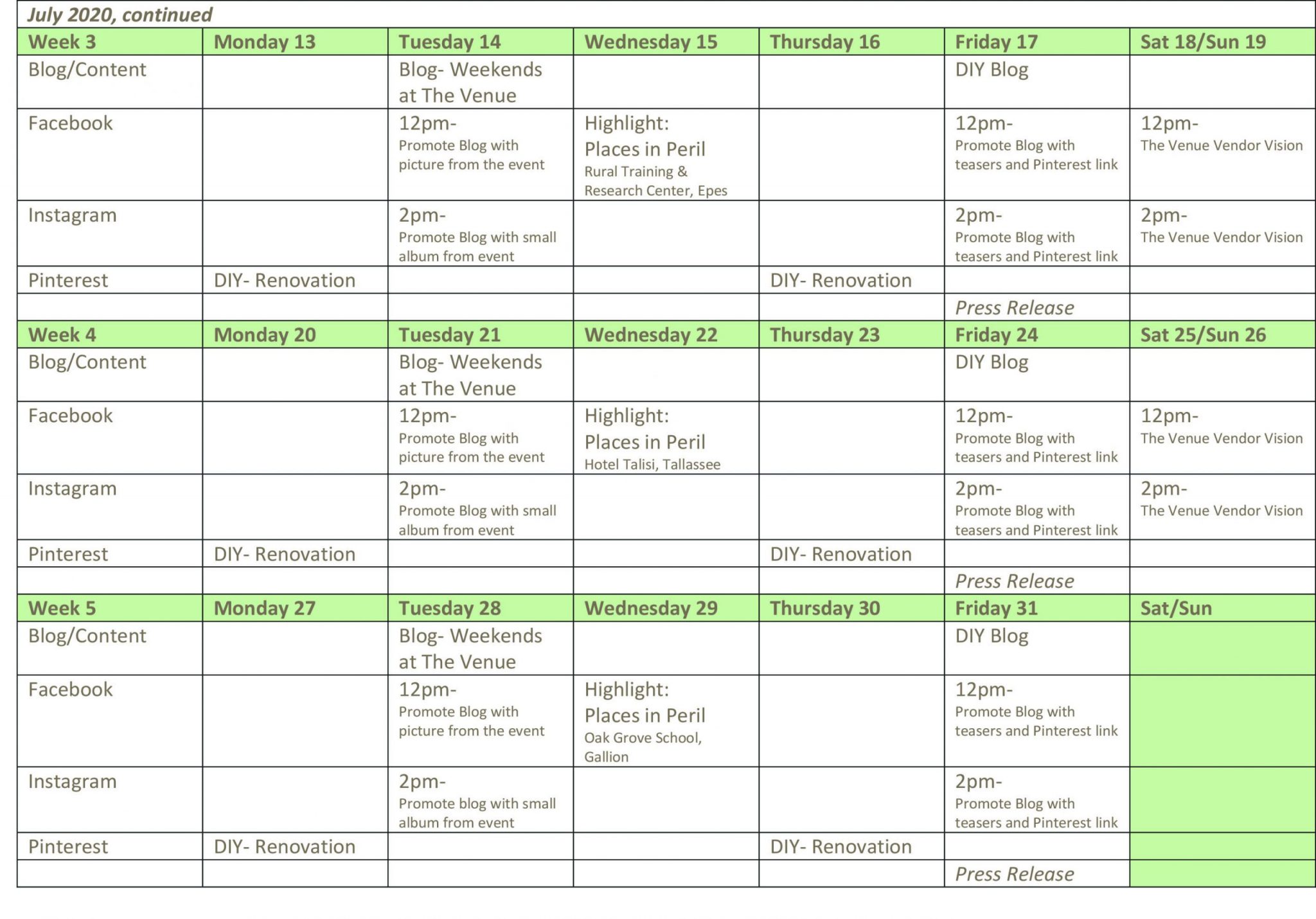
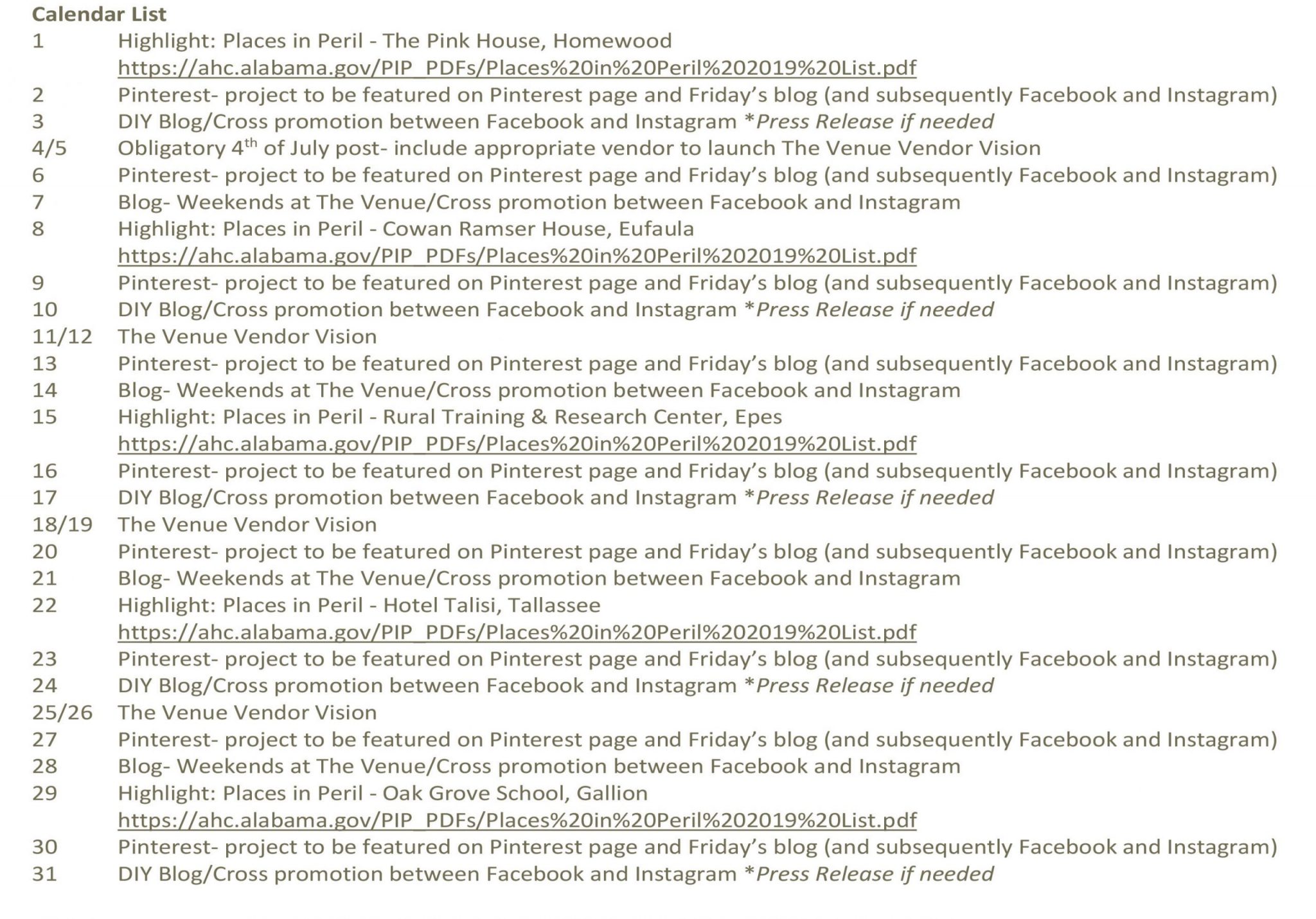
The ask: Create a one-month Social Media Marketing Plan for The Venue.
The process: A 19th Century home in Livingston, Alabama has been transformed from one of Alabama’s Places in Peril to a freshly renovated bed and breakfast and event space. The location was rich in history and design, but desperately needed more social media presence.
…and that’s where I came in!
The interesting part about this project was that all of the pieces were right there in front of me. The client didn’t need a logo, and didn’t ask for any brand collateral, but desperately needed a voice. There was plenty of history behind The Venue, so I had the opportunity to combine that with various untapped social media to set the tone for the client from the ground up. I had the opportunity to utilize that history, the renovations, and cultural uniqueness as I created.
The answer: A comprehensive marketing calendar, including breakdowns of daily plans and descriptions of each social media posting schedule. The client is now set up to continue the plan, simply by plugging in different drives, campaigns and events each month!
Slide through to see each page!
The ask: Various brand logo design.
The process: The best way for a painter to get better is to paint. The best way for a designer to get better is to design! Sometimes it’s something random that happened in my day, and sometimes it’s a logo that I see that could use a refresh. Either way, I start with the words and go from there.
The answer: